Context
📌 Context
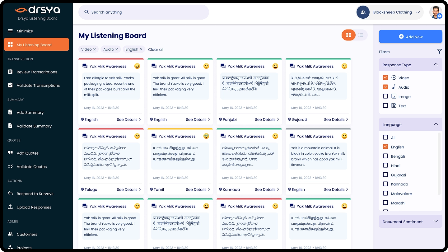
Drsya is a listening board platform that helps businesses capture and manage customer insights from audio and video. While exploring its design, I felt the homepage could be simplified to highlight its strengths better. This led me to create a concept revamp focused on clarity and usability.
The Problem
❌ Problem
The existing homepage had:
- A cluttered layout that made navigation heavy.
- Important features like the Listening Board buried under text.
- Weak visual hierarchy, which made it harder to guide the user’s eye.
- I wanted to improve the first impression while making it easier for users to understand what Drsya offers.
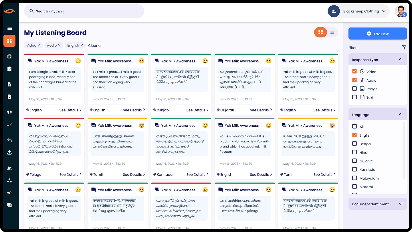
🎨 Design Direction
My approach was to:
- Create a clean, modern grid layout with more white space.
- Bring the Listening Board to the forefront as the core feature.
- Use bold typography + simplified color accents for a fresh, professional look.
- Restructure the content so that users can quickly see the value (Projects, Responses, Admin tools).
Reflection
💡 Reflection
Although this revamp was not part of the live product, it represents my design thinking approach: taking an existing product, identifying areas of improvement, and exploring how modern UI can bring more clarity and engagement.